
Diagramming Demographics
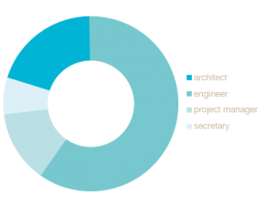
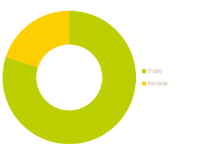
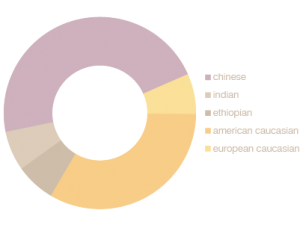
A few weeks ago, I was part of a workshop for a joint project with professionals in the building industry. It lasted a full day, so I had a lot of time to look around and observe the participants. It didn’t take long to notice particular majorities and minorities. So, rather than doodling snakes or infinity elephants, I doodled demographic diagrams. Then went home and did them nicer in illustrator for you.
By profession:
By gender:
By ethnicity:
 I first merged the three categories like this, but it’s pretty illegible:
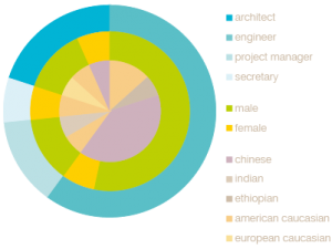
I think this method allows for more conclusions to be drawn:
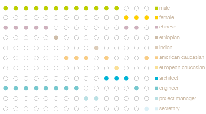
Spot any trends? :P
